Home Destination
Redesigning for Real Impact
Home Destination is the first thing users see when they log into Zoom. But the existing page was falling short: users struggled to find what they needed, key features went unnoticed, and there was little reason to return.
The objective of this project was to redesign Home Destination into a dynamic, personalized entry point to Zoom’s ecosystem, improving clarity, increasing engagement, reducing churn, and driving growth.
Role
UX Designer
I owned the end-to-end UX process, from research synthesis and ideation to high-fidelity design, prototyping, and handoff.
Timeline
Paid Users
Feb 2023 - Jun 2023
Free Users
Dec 2023 - Feb 2024
Impact
10M+ monthly visitors
$1.72M in new MRR
97K+ feature actions triggered
The Problem
Zoom’s Home Destination was hard to navigate, failed to surface key features, and lacked personalization, resulting in low engagement and missed opportunities for retention and upsell.
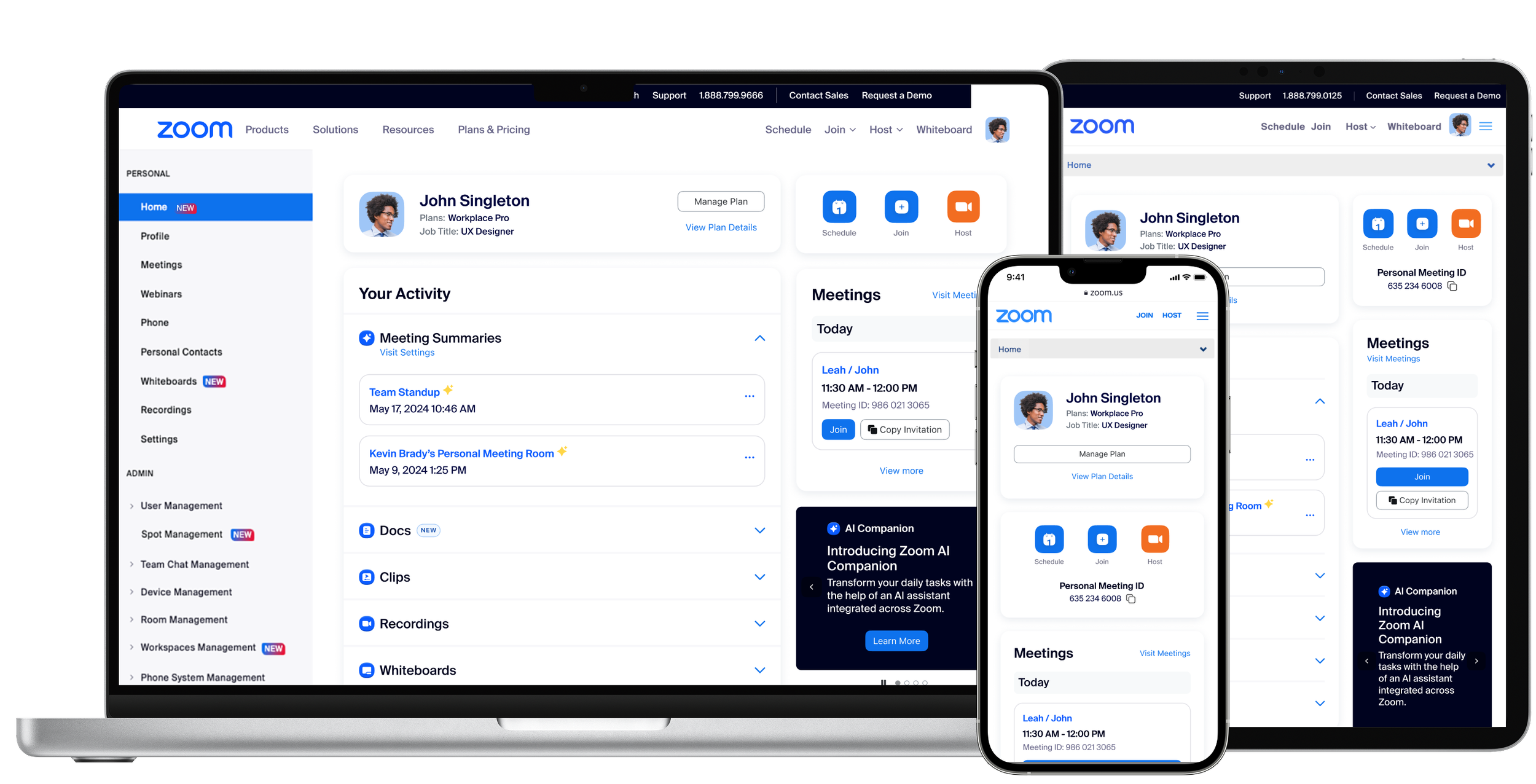
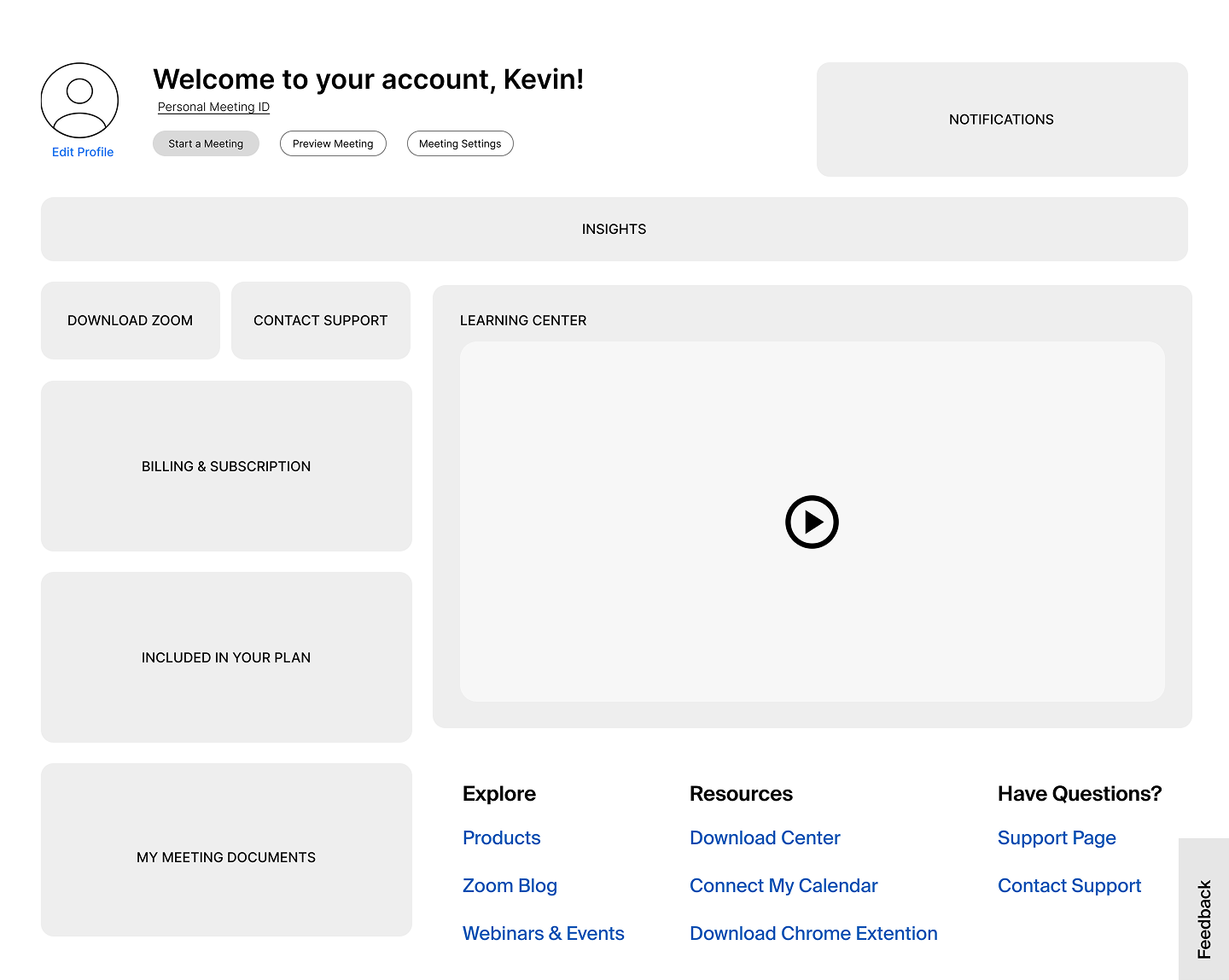
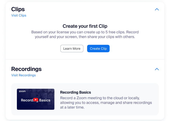
Home Destination before the redesign for free and paid users.
Hard to navigate
Key actions like scheduling meetings or finding recordings were buried.
Low feature discovery
Valuable tools like Whiteboards and Clips were underused.
No personalization
The experience was static and offered no incentive to return.
Business Goals
A smarter first touchpoint
The Home Destination redesign wasn’t just a visual upgrade. It was a strategic opportunity to make Zoom’s web portal more useful, engaging, and personalized from the moment users logged in. By improving clarity and relevance, we aimed to drive stronger engagement, highlight the value of key features, and increase the likelihood of users returning.Boost feature engagement

Highlight underused tools like Whiteboards and Recordings to help users get more from Zoom.
Reduce friction and churn

Make the experience smoother for paid users so everyday tasks feel easier and faster.
Establish a central hub

Turn Home Destination into a go-to spot that shows off everything Zoom can do.
Uncovering
User Pain Points
At the start of the project, it was clear the Home Destination wasn’t meeting user needs. We needed to dig deeper to understand why. I worked with our research and analytics teams to uncover where users were getting stuck and what was being overlooked.
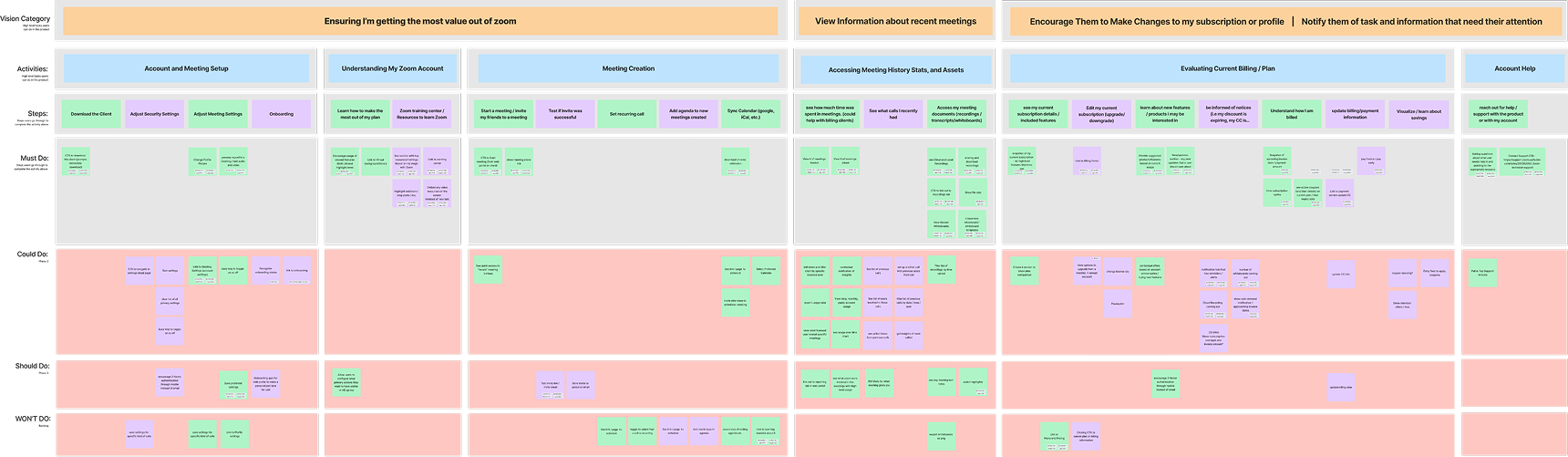
Affinity Map revealed insights that informed the redesign.
Research & Discovery
We used a mix of qualitative and quantitative methods to identify pain points and uncover opportunities for improvement
Contentsquare Analysis
Heatmaps and behavioral tracking revealed how users arrived, interacted, and navigated through the experience.
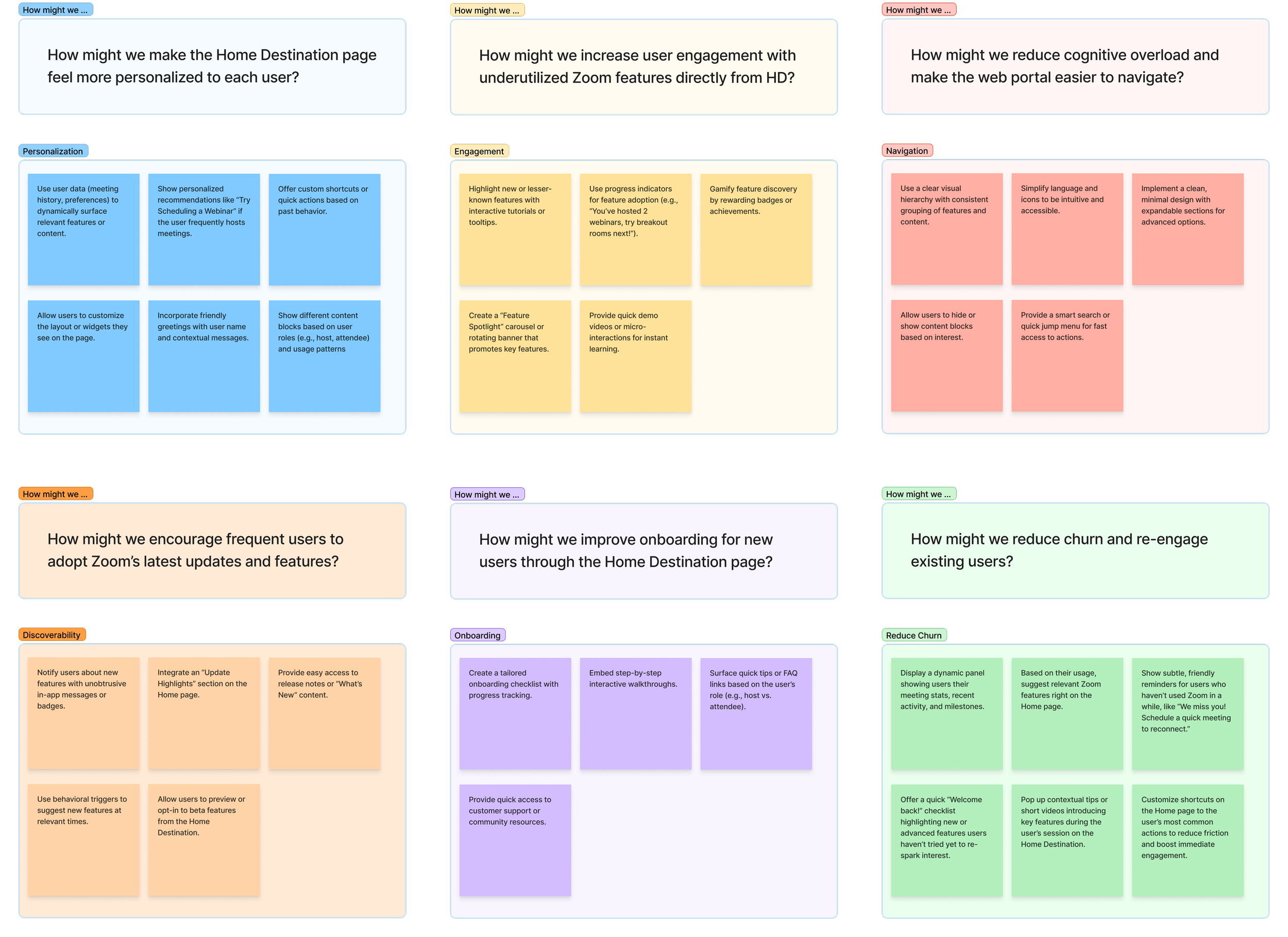
Brainstorming Sessions
How Might We workshops sparked ideas to enhance personalization, boost engagement, streamline navigation, improve feature discoverability, drive adoption, and reduce churn.
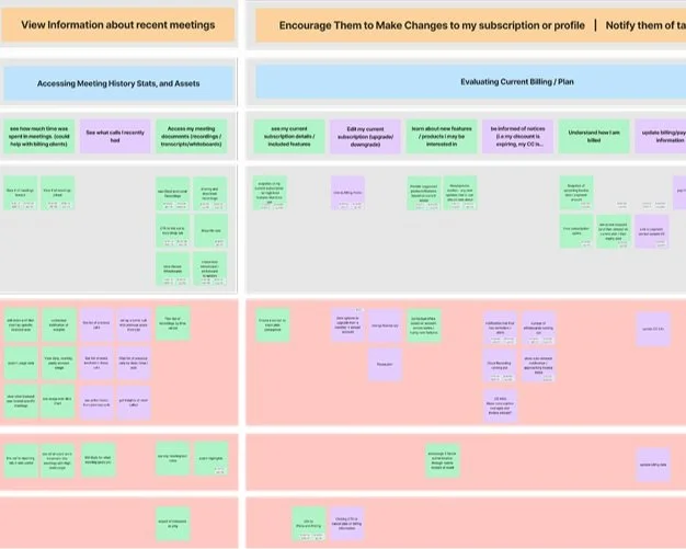
Affinity Mapping
Affinity Mapping uncovered key user activities like setup, scheduling, exploring features, managing plans, and accessing support. Understanding these tasks helped define the necessary user journey steps.
Ideation & Prioritization
We kicked things off with a series of collaborative workshops that included sketching, whiteboarding, and mapping out core user flows for both free and paid users. I worked closely with product, engineering, and research to evaluate ideas against three key criteria: impact on engagement, feasibility, and alignment with business goals. We prioritized solutions that balanced immediate usability wins with long-term value.
Led collaborative workshops to analyze user tasks and map key features.
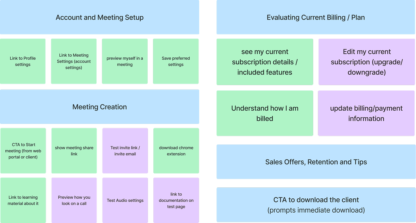
Wireframes & Prototypes
Early concepts explored different layouts and navigation models such as cards, modules, tabs, and feeds. I developed low- to mid-fidelity wireframes to test structure and flow, then moved into high-fidelity prototypes in Figma. Through user testing, we quickly saw that simpler layouts with fewer decision points helped reduce friction. We discarded designs that added complexity or buried essential actions.
Explored multiple layout patterns to evaluate structure and flow, then presented to stakeholders to align on direction.Used interactive prototypes in presentations and handoffs to demonstrate user flows and key interactions.Key Design Decisions
Balancing usability, personalization, and engagement
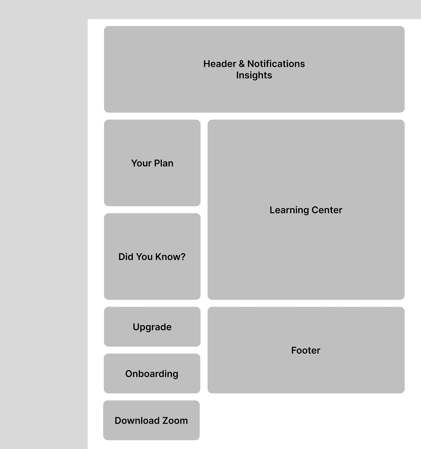
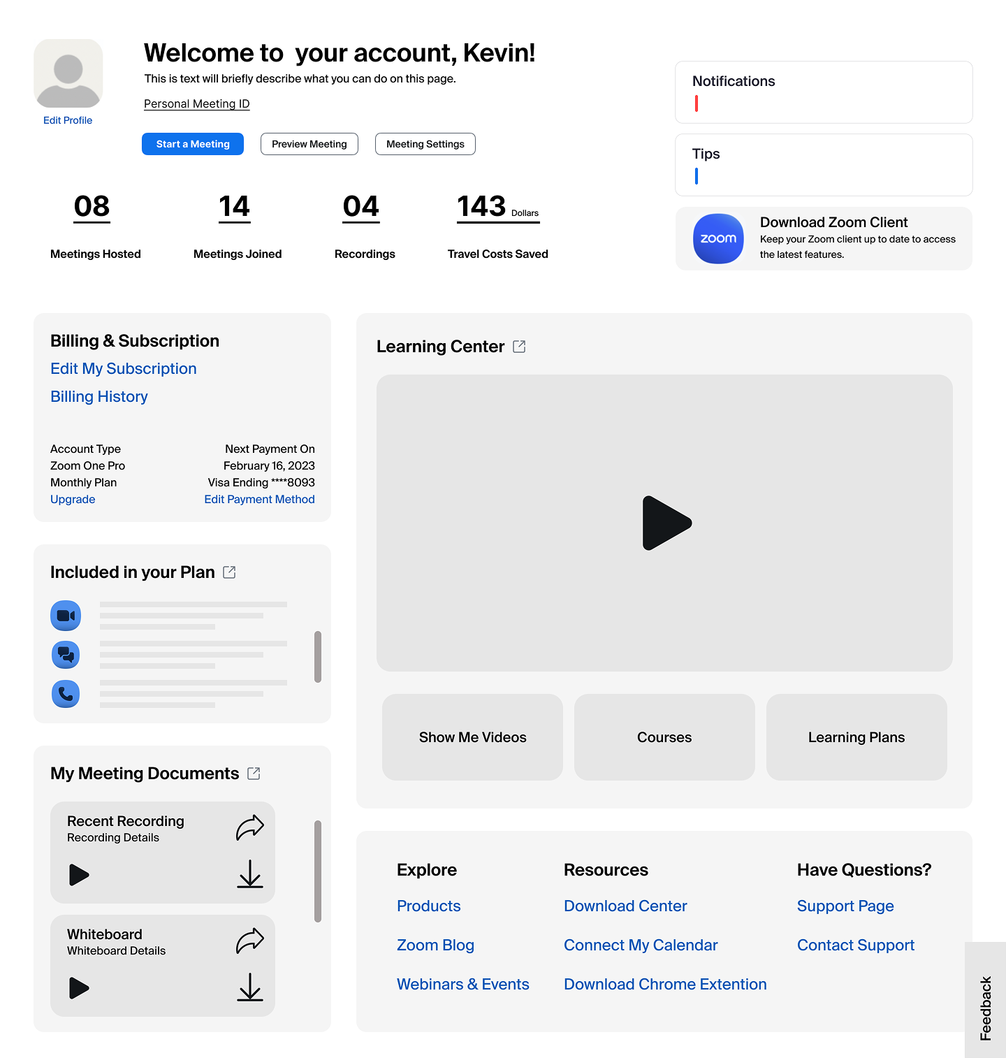
Personalized Dashboard
We created a modular dashboard that adapts to each user by highlighting upcoming meetings, cloud recordings, and smart feature recommendations based on their usage.
Streamlined Navigation
Key actions like scheduling, joining, and accessing settings were surfaced front and center to reduce friction and help users complete tasks faster.
Dynamic Engagement Cues
We added contextual nudges such as tips, reminders, and prompts for underused tools to drive feature discovery and encourage return visits.
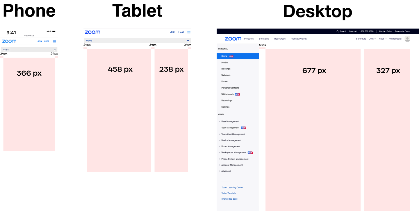
Responsive, Scalable Layout
The entire experience was built using flexible components that scale seamlessly across desktop, tablet, and mobile, ensuring accessibility and consistency everywhere.
Testing & Iteration
Data-driven improvements, tested at scale
A/B Testing & Rollouts
We validated our designs through A/B experiments and staggered rollouts. New features and layouts were gradually introduced to targeted user segments, allowing us to track performance in real-world conditions before launching broadly.
Behavioral Insights with Amplitude
We used Amplitude to analyze user flows and engagement across variations. This helped us understand which elements increased interaction, like clicks on Whiteboards, AI Companion usage, or return visits to the dashboard, and where users were still dropping off.
Key Iterations
Reordered Modules for Improved User Flow
Prioritized high-value actions based on click and scroll behavior.
Optimized Headlines and CTAs for Clarity
Refined messaging to encourage deeper user engagement.
Refined Visual Cues for Enhanced Interaction
Tailored nudges based on user response patterns.
Final Solution
The new Home Destination makes it easier to get things done, discover helpful features, and pick up right where you left off. It’s a more personal, more useful starting point that keeps users coming back.
Impact
↑ Engagement More users actively interacting with HD
↑ Feature adoption Cloud Recordings and Whiteboards saw increased usage
↑ Conversion More free users upgrading to paid plans
↓ Churn Better retention among paid users
↑ Efficiency Faster time to access key actions
Reflection and Learnings
Cross-functional Alignment
Close collaboration with engineering from the start helped keep the design vision intact through launch. Weekly check-ins made sure everything stayed feasible and cut down on last-minute surprises, making the handoff feel smooth and efficient.
Reducing Friction
Making the web portal easier to navigate helped guide users to what they needed, and encouraged them to return. Testing and tracking helped us spot where users were getting stuck and smooth out those rough spots.
Balancing Business and User Goals
By aligning user needs with business objectives, we created a solution that increased trust and usability while supporting key conversion goals.
Conclusion
Redesigning Zoom’s Home Destination taught me the power of combining data, design, and cross-functional alignment to drive real impact. By grounding every decision in user behavior and rolling out improvements thoughtfully, we created a more useful, engaging entry point that meets both user and business goals. Leading this project end to end, from discovery through launch, reinforced the value of designing with intention, staying close to the data, and never losing sight of the person on the other side of the screen.